Data Through the Looking Glass: Part 1
An introduction, and the Three Commandments of Good Data Analysis
Information, Writ Large
Claude Shannon changed the meaning of the word information. He took an everyday word with a vague meaning, information, and gave it a concrete, mathematical definition. Isaac Newton did this too, three centuries earlier. Before Newton, mass was a concept, not a unit of measure. Force could not equal mass times acceleration, because none of those quantities were defined. And like Newton, Claude Shannon’s mathematical definition of information changed the world. Combined with the invention of the transistor in 1947, the groundwork was laid for a new age of humanity — the Industrial Age withered away and the Information Age was born.
Eighty years later, data is everywhere. More people than ever are highly educated and closely connected by quasi-instantaneous global communication, with easy access to vast quantities of data. And with this explosion of data, the fundamental problem of experimental science is increasingly relevant to the non-scientist: What does it mean to do data analysis? Further, what does it mean to do it right?
In this series of posts, I want to write down my thoughts about data analysis, particularly in the scientific context. Now, I tend towards agreeing with Rutherford, who once said:
If your experiment needs statistics, you ought to have done a better experiment.
-Ernest Rutherford
Unfortunately, sometimes your data is just irretrievably messy, and you need to extract signal from noise.
Part 1 of this series will focus on the three commandments of data analysis. Following these three commandments will give you a great foundation for valid data analysis.
Parts 2 → N will be quite different — I will explore some case studies of bad data analysis, from honest mistakes to incompetence to outright fraud, because learning how to do something wrong is almost as important as learning how to do something right.
THE FIRST COMMANDMENT
Be certain thou hast done the correct experiment.
The basic problem with analysis is summed up by the following quote:
If you torture your data long enough, it will confess to anything
- Ronald H. Coase
Data analysis is at least partially subjective. Data is (usually) some large set of numbers and labels that must be compressed into human-readable “meaning.” The bias of the experimenter creeps into this process in two ways.
The experiment design — I chose to do this particular experiment in this particular way, and my choice of methodology determines which data I will measure.
The analysis of the results — It’s my job to turn many, many numbers into a “conclusion,” whatever that means. But my inherent biases color my interpretations of that data.
Experimenter bias in science is impossible to avoid, given that someone (or some-thing, when the machines show up) is doing the science. Good experimental design mitigates failure mode 1 to the greatest extent possible. Since this series of posts is going to be primarily on analysis, not design, I’m going to skip detailed discussion of failure mode 1 and focus on failure mode 2.
Let’s look at a couple examples.
Faster-than-light Neutrinos
Let’s say you’re a scientist looking for a type of neutrino, and, shockingly, you find some that appear to be moving faster than the speed of light!
You check your data really carefully, and do all the appropriate significance testing, finding a significance of p = 2 * 10^-7 — less than 1 in 1,000,000 chance of a false positive. You publish your results exactly as you find them, and invite the scientific community to scrutinize them for possible errors and to replicate them.
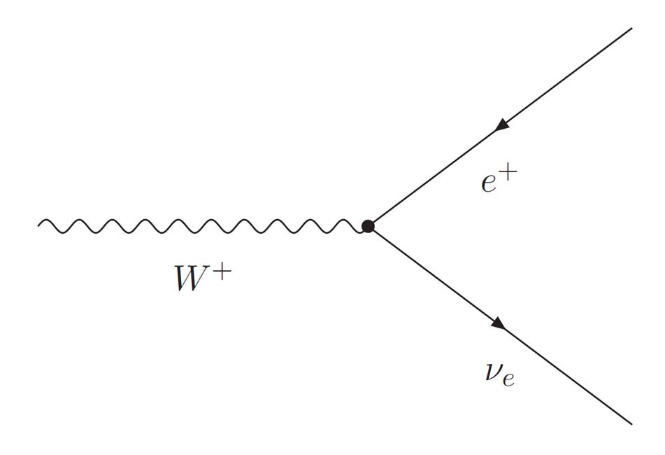
This is exactly what happened at OPERA. The scientists at OPERA did everything right when they saw these physics-breaking neutrinos. They knew that this result was almost certainly wrong, but they did all the appropriate data analysis, correcting for all the right sources of noise, and still got a faster-than-light neutrino. The OPERA scientists published their results and asked for help from the broader community.
As it turned out, the OPERA experiment had a loose cable that caused their neutrinos to gain a few nanoseconds relative to their reference clock. Instead of measuring the speed of their neutrinos, they were measuring the time delay caused by their loose cable.
This is an important lesson — data analysis cannot compensate for experimental errors.
The OPERA scientists correctly analyzed their data, and their statistics correctly informed them that this was not a result obtainable by chance (p < whatever). But that didn’t matter, because they weren’t actually measuring their neutrino speed, so their conclusion was completely wrong.
My Very First Paper
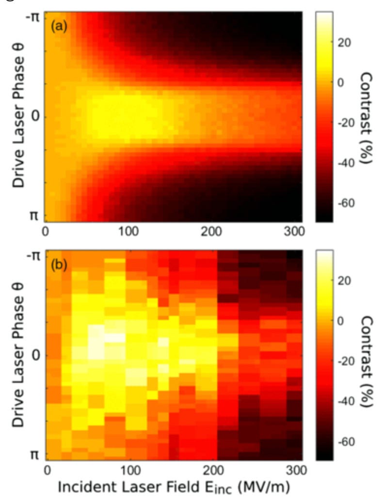
The very first paper I ever published was very nearly complete garbage. Here’s my first paper, called Laser-Driven Electron Lensing in Silicon Microstructures. I was trying to measure the strength of a lens (this type of lens focuses beams of electrons). The key metric was something I called contrast: electrons detected when the lens was on divided by electrons detected when the lens was off.
I had just completed my first set of experiments, and I had measured pretty good looking data! There was only one problem, the contrast I measured (~20%) was about double what I thought it should have been (~10%).
I discussed my suspicions with my advisor, and he also felt that this was suspicious. My measured curve looked nearly identical to my simulated curve, but how could I measure more contrast than I simulated? Shouldn’t it be the other way around? I decided to do the experiment again, just to be sure.
While I was redoing the experiment, the postdoc I was working with suggested a simple control experiment. If we removed this particular component, and the experiment was working properly, I should measure 0% contrast.
Instead, I measured exactly the same 20% contrast as before. Uh oh.
As it turns out, there was a dead spot on my detector, and when the lens was on, it shifted the electrons away from the dead spot, artificially increasing the measured contrast. Instead of measuring the action of my lens, I was actually measuring the response of the detector. Oops.
After re-calibrating the detector, and making certain that the control experiment did in fact show 0% contrast, we redid the experiment and got results more in line with my simulation. Hooray! My results are real now, right? Well, I think so, because I couldn’t find anything else wrong with them, but by the very nature of this problem, I don’t know. I hope so.
In both of these cases, a hidden flaw in the experiment completely invalidated any and all data that was measured. Not only this, but the hidden flaw was really hard to find even when you were actively looking for it. No amount of data analysis could have compensated for this minor experimental flaw. This is lesson one.
All good data analysis must start with the assumption that the data comes from a valid experiment. It is shockingly easy to perform a completely meaningless experiment that looks meaningful. Control experiments are key. Skepticism of your own results is key.
THE SECOND COMMANDMENT
Thou shalt create a faithful visual representation of thy data.
Being able to look at your data is extremely powerful. Use your ability to recognize patterns to get a sense for your data, and it will help you make good choices about how best to analyze it.
Let’s say I’m reading the abstract of a paper:
We, the authors, after meticulous study design and rigorous data analysis with copious machine learning, find that statistic X strongly correlates with outcome Y (N=26, p = 0.024).
By the standards of most sciences, this is a pretty strong statement, with p < 0.05.
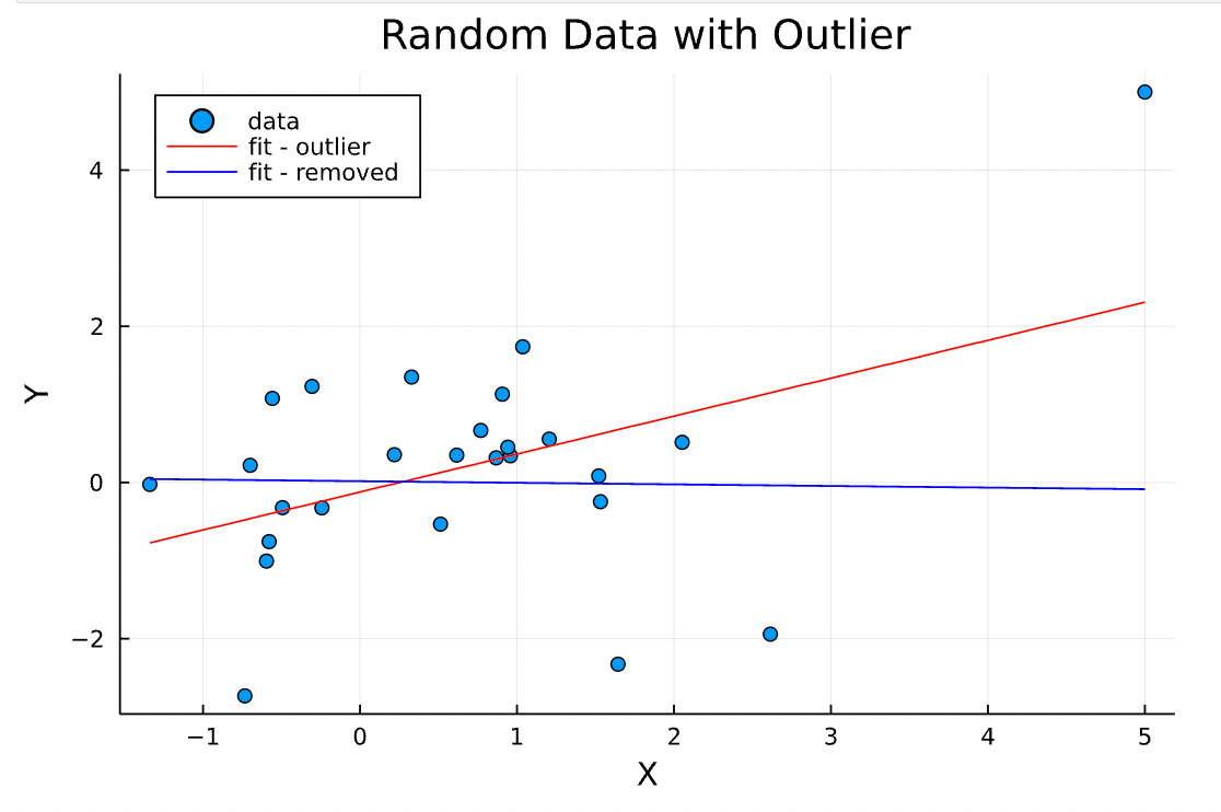
Here’s the data from which the (fake) authors drew that conclusion:
This data looks completely random, except for that outlier in the upper right corner. That’s not obvious at all from the (completely accurate) abstract, but the scatter plot makes this fact obvious.
How did the authors analyze the data? They (a.k.a. me) applied a simple linear regression model to the data. Applying a linear model to data means that I assume this data is modeled by the relationship
Y = Xβ + ε
and I try to find the beta and epsilon which “best” predict Y given X. That word “best” is doing a lot of work, mathematically, but let’s ignore the subtleties for now. Here’s the results of the linear regression:
I’ve highlighted the important numbers in red here — this linear regression model says that Y is correlated with X with a slope of 0.48, and a t-score of 2.4.
The coefficient is the slope of the line, or how much Y depends linearly on X. If the coefficient is zero, that indicates that X and Y are not linearly correlated. What is the confidence of this prediction? That is given by the t-statistic, which is the coefficient divided by the standard error. The higher t is, the more significant the correlation.
We can convert the t-statistic into more easily interpretable p-values with standard tables. In this case, t = 2.4 translates to p = 0.024. That’s well below the significance threshold of p < 0.05, so we conclude that this relationship, Y ~ 0.48 * X, is significant! My statement, as the author of this fake paper, is completely accurate.
Or is it? If I went into this analysis blind, I might be tempted to stop there. But, since I can see the data and notice that outlier, let’s redo the analysis and remove that point.
The correlation between X and Y completely disappeared. The coefficient went to 0, and the t-statistic did too. Our correlation depends entirely on that single data point. This fact is not captured at all by the p-value, but is very obvious from the plot.
So, the correlation must be fake then, if it depends on the single point, right? Well, no, not necessarily. Visualizing our data has led us to the conclusion that the significance of our data set depends entirely on the outlier. How can we decide whether to keep the outlier or not?
THE THIRD COMMANDMENT
Know thy noise floor.
Let’s return to our plot, without the fits, but now, let’s add a “noise floor,” set at Y = 1.
What is a noise floor? The noise floor is a concept stolen from signal processing, but that applies to literally every measurement. From Wikipedia:
the noise floor is the measure of the signal created from the sum of all the noise sources, where noise is defined as any signal other than the one being monitored.
In other words, the noise floor is your ultimate measurement limit. Any data point measured below (or near) the noise floor is deeply suspect and not to be trusted.
Every measurement has a noise floor. In human studies, it could be the contributions from lizardmen (great article, highly recommend). In physics research, it can be the sum of all the noise generated by your measurement electronics. In optics, it’s usually the dark count rate of your photodetector.
Returning to our plot, we notice that actually, most of our data points are below the noise floor, and therefore (probably) meaningless. If we interpret Y as the signal-to-noise ratio or SNR, then the outlier is the only point that is significantly above the noise floor. Maybe our measurement just doesn’t show much signal until X reaches about 5, and only then do we have sufficient resolving power to see the effect. Maybe the outlier is the only relevant data point here.
This is a point that often gets lost in the softer sciences — every measurement has a noise floor, and if your experiment or study lacks sufficient resolving power to measure above the noise floor, your data is meaningless.
So how should I analyze this data? Context is everything.
Let’s say I’m a fifth grade teacher measuring my students’ performance. Y is test score, and X is height. I’m not sure what my SNR is, but I have a fairly strong prior that test score is not likely to be correlated with height. The outlier is probably meaningless — remove it, and we see no correlation.
Let’s say I’m a materials scientist, and I’m studying superconductors. X is temperature, and Y is resistance. Now, it looks like my material has zero resistance right up until X ~ 5, at which point I see resistance again and my material is no longer a superconductor. The outlier is probably not noise, and definitely worth investigating further. Keep it.
Let’s say I’m an entomologist studying ant colonies, and X is colony size and Y is behavioral complexity. Is there a threshold effect when colony size reaches X ~ 5 when ants become superintelligent? I have no clue, but I know that I only have N = 26 data points, and standard error of measurement σ/N scales like 1/sqrt(N). It definitely means I should go investigate huge ant colonies. This touches on reproducibility, a critical part of any good experiment, which will be discussed in later parts of this series.
In Conclusion
Data analysis is ubiquitous, complicated, and subjective. It requires a deep understanding of the thing being measured, and the “correct” subjective choices to make are highly non-obvious and differ drastically with context.
In this first section of Data Through the Looking Glass, we looked at three commandments that must be obeyed if one is to do good data analysis. They are:
Be certain thou hast done the correct experiment.
It’s very easy to accidentally measure total garbage that looks meaningful. Know your experiment.
Thou shalt create a faithful, visual representation of thy data.
Visual data exploration is the best tool you have for getting a sense of how your data looks. Use metrics and regression analyses in a context-aware fashion
Know thy noise floor.
Some signal is indistinguishable from pure noise. Know the limitations of your experiment.
If you observe these three commandments, you will start with an excellent foundation upon which to build your analysis. The next parts in this series will look at examples of bad data analysis, both honest and dishonest.


Good article. I will say a couple things. One mathematical Statistics cant fix bad data (This should be obvious). It can only look for patterns in data. The linear regression example is actually a much worse problem when you look at high dimensional data. That is when it is 2d its very easy to look at and see if things make sense. If I have 100D data I can’t do that easily. In fact with high dimension some very bad things can happen. There are tools to deal with this though. There is a concept called leverage in Linear regression. That outlier point has massive leverage and would call the regression into question instantly. In fact keep in mind that the equation for linear regression is pretty meaningless unless you make some assumptions of the error terms. If that assumption is wrong you can be in trouble. How much trouble kinda depends